If you’re like me I see all these amazing photographers out there who have this modern, intense color, edgy look. Have you wondered how to get such amazing pictures? How do they make the colors so vivid,? How do they get that edgy look? Well today I’m going to teach you how…well with the help of a GREAT photography blog and tutorial I found.
The look I’m talking about is called Lomo Photography. Most of you are like me and saying Lomo…what? Ok , Lomo is a type of camera. It was manufactured in Russia, and wasn’t a very good camera. It created pictures with a strange vivid look and a characteristic vignette. However over time this camera has somewhat become legendary for the look it produces, which is now known as Lomo photography.
Well someone (sorry don’t know who to give the credit to) came up with a way to reproduce the Lomo Photography look using Photoshop. ( I love digital!) Here is the link to the step by step directions…
Now when I came across this tutorial a few days ago, I was more than excited to try it out and see. I was a little unsure if I was going to get all the steps to work since I unfortunately don’t have the full version PhotoShop but rather only Elements. So if you’re like me and can’t afford 800.00 to get the good PhotoShop (you can get elements for about 80.00) I’ll also leave you with a few tips.
Tips for PSElements Users:
*When you get to the step to create your vignette you will find the “levels” under layers +adjust layers
* when creating the “s” you will need to go to enhance, +adjust color curves, + advanced options.
* When creating the new layer you want to make sure to check the box group with new layer. You will want to adjust your opacity to 40 (or whatever works for your photo…see examples) BEFORE applying your paint bucket (and make sure you have the black color selected for the paint bucket beforehand also)
*Make sure to merge your layers THEN go back into layers, + adjust layer, + hue & saturation
* When doing the unsharp mask I totally bypassed all the color lab, and channel stuff everything you need is under enhance, + unsharp mask.
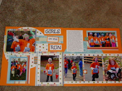
Here’s what I came up with….
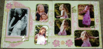
Before
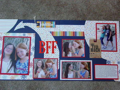
 After applying the Lomo Photography technique. This was my first attempt at this, I almost wonder if my vignette is a little too thick- but since its the first step in the process I wasn't going back LOL!
 Before
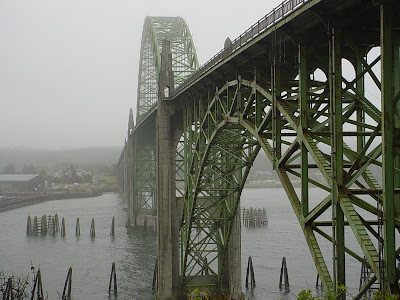
 After
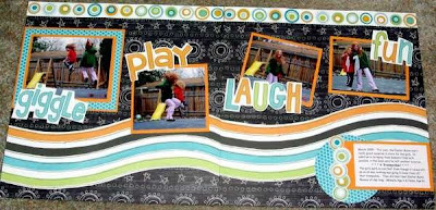
AfterMy second attempt at the Lomo technique. I may have done a slight less opacity so my whites poped a bit more, but I didn't learn that lesson till attempt #3.
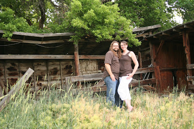
Before
 After
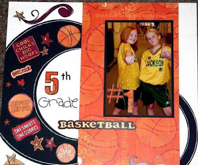
AfterAttempt 3. I learned that when doing the paint bucket layer that 40 opaticy can be too much especially in photos whith a lot of white. In this photo I only used a 15% opacity and I think it worked much better. In addition to the Lomo technique I also cropped the photo for tighter & cleaner look.
I think lesson I learned was this toturial ROCKS! However if your unexperienced in PhotoShop (like me) take time to play (the edit button can be your friend!) However don't feel traped to all the exact levels and numbers stated, every photo is different, if it needs something different-go ahead you have creative licence.
I challenge you to try this out. Send me your before & after pictures to info@iceescape.net and the ICE team will choose a winner- plus we'll post your creations here with all the due credit!
****Heather****