
 The ICE Team is back on track after taking a small break after our last event. That also means Inspiration Tuesday is back!! Many of us have been wowed the past several months while ICE's own Heather has provided us with some super cool projects and ideas. We're now expanding Inspiration Tuesday to other members of the ICE team, as well as featuring talents from some special guests! Don't worry Heather will still be inspiring us with her amazing ideas on a regular basis as well.
I'm Tracy, one of the ICE coordinators. Today is my turn to share some inspiration with you! Some of you joined me for my beginner class at ICE in May. For those of you who came, you know we had a lot of fun and I think I learned as much from you as you may have learned from me! One big part of my beginner class is where I discuss elements of good design. I find that even seasoned scrappers benefit from this information, so I wanted to share it on our blog as well. Many of these things you may already know, but it's at least a good reminder. Who knows, you may actually learn something new.
Top Five Elements of Design
1. Identify the Theme or Mood You Want Your Layout to Convey:
Take a look at your pictures, your journaling or memorabilia – what theme or mood comes to mind? Maybe it’s birthday party pictures the convey a mood of fun and celebration. Or maybe it’s heartfelt journaling that coveys a much different mood. By Identifying the theme or mood, it will help get the creative juices flowing and you can then move on to paper and embellishment selection. We'll talk about this more when we talk about Color and Pattern.
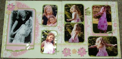
In this layout, that a friend of mine scrapped for me, she did a wonderful job conveying a girlie, soft, Mom & Daughter theme with the papers and embellishments she chose. She showcases these pictures of my daughter and I beautifully!
2. Choose a Focal Picture:
If you are scrapping with a grouping of pictures, choose one from the grouping to be your focal picture. It might be what you consider your favorite out of the bunch. Or it may be the picture that best conveys the mood or theme of the photos. When designing your layout, treat your focal picture special, do something to make it stand out. You can double mat the photo, crop other photos smaller, or accent in a creative way.
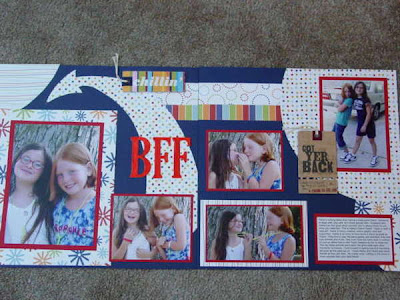
In this layout I emphesized the focal picture by adding an arrow:
3. Use Color and Pattern to Emphesis Your Theme:
Now that you’ve identified your Theme or Mood and have your focal picture, select colors that will compliment the focal picture, and colors and/or patterns that will help to convey your theme.
In this layout with pictures of my kids on the trampoline, I wanted to convey the theme of fun and motion. I used playful and bright colors and added fun wavey paper to give the feeling of motion. 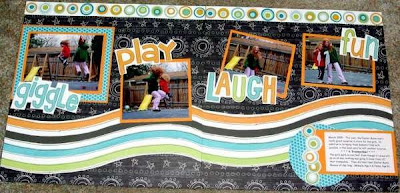
4. Use Repetition to Convey Theme and Enhance Photos:
Select elements to add to your page that repeat the theme. Elements can be stickers, pre-made embellishments, shapes, or even colors & patterns.
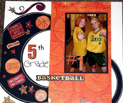
In this layout, I used girls basketball accents to enhance my theme:
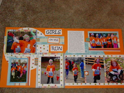
5. Flow & Balance:
Flow: Design your layout to make it easy for the eye to follow through the design. Our eye is used to traveling from left to right, so an easy way to layout a page is to start with your focal picture and add other photos or accents going to the right.
Balance: When designing a double page layout, try to be careful to not overload one side of the layout making it appear heavier than the other. Remember larger accents have more weight, and smaller accents appear lighter. You can balance a large photo with maybe two or three corresponding smaller photos. You also want to balance your colors. Your design will be more appealing if you use color choices on both sides of the layout. So if you add a splash of yellow to the left side, balance it out with a splash of orange on the right.
When you view this layout, your eye easily follows from left right by starting with the focal picture and placing the photos on the right in a linear pattern. I added balance to the layout by using the same papers on both sides of the layout. I also balanced the weight of three pictures on the left side, and four pictures on the right by adding the circle behind the focal picture to make it stand out more and give it more "weight".
Now remember everything I shared with you here are guidelines. Do they need to be applied on every layout you scrap? - NO! But if you think about, and follow some of these guidelines, it might help get your creative juices flowing, and you might find that you like the end result of your layouts more.
What about you? Can anyone share any layout or ideas they have either applying the design prinicples above? Or do you have a design principle that you use that you find makes your scrapping better. Send us an e-mail at info@iceescape.net, or post a comment on the blog. Who knows, I may have a surprise for some lucky person who shares.


1 comment:
I love all the layouts you did. I hope to case them a bit and make great layouts like you.
Caralee
Post a Comment