Tuesday, August 5, 2008

Favorite Photos Album


When your going through your pictures deciding what to scrap, do you ever come across a really special picture? You know what I mean, the one that makes you go tap someone on the shoulder and say "Hey look at this one. I just LOVE this picture!" Then, your scrapbooking creative juices start kicking in, and you start thinking in your mind what you can do to make that picture really stand out on the layout. You start to calculate the dollars and dollars of scrapbook supplies you might spend to create a masterpiece worthy of supporting that special picture. Or you may dig that extra special patterned paper out of your stash, that paper you've been saving for something really special.


I'm sure you can relate. We all have them - Our Favorite Pictures. A few years back after hearing the suggestion from a fellow scrapping friend, I started a "Favorite Pictures Album". I must admit, this is my favorite album. The one I break out first to share with family and friends. The one my own family enjoys the most.


My first step was to decide what size album I wanted. I knew I didn't want a 12 X 12 album, thinking that would be too big, since most of my layouts would only have one photo. I also thought that, for me, a 6 X 6 would be too small. So, just like Goldilocks, I found the album that was "Just Right!" I selected a 8.5 X 11 album with a landscape (horizontal) orientation.


Selecting the album was probably the hardest decision in this process. From there, all "rules" from my other family albums were put aside. In this album, the layouts aren't chronological, I don't do double page spreads, and I don't even journal on all the layouts. I just find that photo that "speaks to me" and I scrap it! Simple and easy as that! At first I started off simple getting used to the new orientation. I found it so fun to whip out a quick layout in a matter of minutes.


Then I got to thinking more about this album, and a way to make it even more special. I decided that in this album I'd take the opportunity to tell my kids how wonderful I think they are, what I think is special about them, or give them words of advice. I direct the journalling right at the subject, saying "You, we, us" Where as in my other albums I tend to summarize and journal in the 3rd person. I also decided that on this album, even though I hate my own handwriting, I'd write some of my own journalling. Have you ever ran across a note or letter handwritten by a loved one. You know how it makes you warm and fuzzy inside, and makes you think of that person, actually "feel" that person - I wanted to do that here. So someday when my kids look back on this they'll be able to feel Mom's love.


Sometimes, when I create a layout all I have to do is just enlarge the photo to 5 X 7 and plop in down onto some beautiful patterned paper! I love how quick some of these layouts go!


I hope this blog entry inspires you to maybe consider making your own Favorite Photos Album! If any of you out there have a similar album, we'd love to see your layouts too! Please e-mail them to info@iceescape.net. Also please share your comments, ideas, and feedback on our blog or message board!
Happy Scrapping!
Tracy

WINNER, WINNER, WINNER!

Ok so I am a bit forgetful. just blame it on a zombie like state I lived in for a week or two after ICE '08.

I offered a prize for comments on this blog entry, http://iceescape.blogspot.com/2008/06/life-after-ice.html and sadly I forgot all about it. So a girls gotta live up to her word right-better late than never I say.

So guess what? Everyone who posted a comment to that post...YOU ALL WIN! Yeah! I have to go shopping (oh darn) but be watching your mailboxes!

Tuesday, July 29, 2008

Make Your Photos **POP**

If you’re like me I see all these amazing photographers out there who have this modern, intense color, edgy look. Have you wondered how to get such amazing pictures? How do they make the colors so vivid,? How do they get that edgy look? Well today I’m going to teach you how…well with the help of a GREAT photography blog and tutorial I found.


The look I’m talking about is called Lomo Photography. Most of you are like me and saying Lomo…what? Ok , Lomo is a type of camera. It was manufactured in Russia, and wasn’t a very good camera. It created pictures with a strange vivid look and a characteristic vignette. However over time this camera has somewhat become legendary for the look it produces, which is now known as Lomo photography.

Well someone (sorry don’t know who to give the credit to) came up with a way to reproduce the Lomo Photography look using Photoshop. ( I love digital!) Here is the link to the step by step directions…

Now when I came across this tutorial a few days ago, I was more than excited to try it out and see. I was a little unsure if I was going to get all the steps to work since I unfortunately don’t have the full version PhotoShop but rather only Elements. So if you’re like me and can’t afford 800.00 to get the good PhotoShop (you can get elements for about 80.00) I’ll also leave you with a few tips.


Tips for PSElements Users:
*When you get to the step to create your vignette you will find the “levels” under layers +adjust layers

* when creating the “s” you will need to go to enhance, +adjust color curves, + advanced options.

* When creating the new layer you want to make sure to check the box group with new layer. You will want to adjust your opacity to 40 (or whatever works for your photo…see examples) BEFORE applying your paint bucket (and make sure you have the black color selected for the paint bucket beforehand also)

*Make sure to merge your layers THEN go back into layers, + adjust layer, + hue & saturation

* When doing the unsharp mask I totally bypassed all the color lab, and channel stuff everything you need is under enhance, + unsharp mask.

Here’s what I came up with….

Before


After applying the Lomo Photography technique. This was my first attempt at this, I almost wonder if my vignette is a little too thick- but since its the first step in the process I wasn't going back LOL!

Before


After
My second attempt at the Lomo technique. I may have done a slight less opacity so my whites poped a bit more, but I didn't learn that lesson till attempt #3.


Before

After
Attempt 3. I learned that when doing the paint bucket layer that 40 opaticy can be too much especially in photos whith a lot of white. In this photo I only used a 15% opacity and I think it worked much better. In addition to the Lomo technique I also cropped the photo for tighter & cleaner look.
I think lesson I learned was this toturial ROCKS! However if your unexperienced in PhotoShop (like me) take time to play (the edit button can be your friend!) However don't feel traped to all the exact levels and numbers stated, every photo is different, if it needs something different-go ahead you have creative licence.
I challenge you to try this out. Send me your before & after pictures to info@iceescape.net and the ICE team will choose a winner- plus we'll post your creations here with all the due credit!
****Heather****


Tuesday, July 22, 2008

Guest Designer!

Inspiration Tuesday Guest designer, ICE Vendor'08, Becky Robers of Stampin' Up!
Card:
Cardstock: River Rock & Chocolate Chip, Ginger Blossom Designer Series Paper
Stamp Set: Year After Year, All Holidays
Accessories: Blender Pens, White Gel Pen, Chocolate Chip Satin Ribbon, corner Rounder


Explosion Box:
Cardstock: Chocolate Chip & Very Vanilla, Ginger Blossom & River Rock Designer Series Paper
Stamp Set: Year After Year, Fast & Fun Notes, Little Flowers
Accessories: Vanilla Wide Grosgrain, Vanilla Grosgrain, Eastern Elegance Rub-Ons, Stampin’ Dimensionals, 1” Circle Punch, 3/4” Circle Punch, ½” Circle Punch, ¼” Circle Punch, Boho Flower Punch


The pattern is on the Score Pal Website http://www.scor-pal.com/dec_magazine/index_files/Page327.htm


Becky Roberts
Stampin' Up! Demonstrator, Manager
(208) 629-8702
yasou@cableone.net
Blog: inkingidaho.blogspot.com
http://www.beckyroberts.stampinup.net


Tuesday, July 15, 2008

Coffee Creations....


ICE is all about inspiration and this is Inspiration Tuesday, so I am thinking that I should be doing something here that will inspire you. I have been racking my brain to come up with a project and take pictures of each step and so on…as has been on this blog many times. But that so isn’t me! Then I think “wait, this is my time on this blog, I can do whatever I want here..I can break the rules” (ah, we don’t really have any rules, but you know what I mean, where you just think you should be doing something a certain way.)

I don’t consider myself to be “off the top of my head” creative, or as “scrappy” creative as both Heather and Tracy. I really have to think to get the creativeness out! This is why it takes me so long to scrapbook a page or do anything remotely creative. I have to say that lately I have been much more into decorating my house than scrapbooking so I thought of something that mixes the two. I promise, if you stay with me here, I will inspire you to do something!

This started with my addiction and love of coffee and decorating my new house. I tend to ramble sometimes so forgive me if I do. Do you think some of this rambling could be caused by too much caffeine?

So, yes, the addiction and love of coffee…besides my many trips to the coffee shops, and along with my own espresso machine, my wonderful husband gets up every Sunday morning and drives to the nearest Starbucks to get me a latte.

What is really amazing is that my husband does this for me. Not so much that he goes and gets something for me, but this is a very macho man that I speak of. Just to imagine the words “Grande Vanilla Latte “coming from his mouth is almost unthinkable. But somehow he always comes home with right drink!

My house decorating…I was in my house for 6 months before a single decorating idea finally came to me…..then it kind of started snowballing….I have lots of ideas for the house, but it is one piece at a time and many times something that I just run across, and think, that would be perfect for that spot.

This is what happened with my cookbook holder. Now, to anyone that knows me…this is funny because cook, I do not! Ah, but the cookbook holder was so cute and I had the perfect spot for it. It just needed to be painted to match my red and black, coffee, with a few flowers, themed kitchen. Now of course as you can see, I could never cover up the top part of this with an actual cookbook of all things! Besides whatever went on here it had to match everything else!

Here is where the ideas started coming out. I had to make something to go on the cookbook holder. I have never done an acrylic album before, but oh wouldn’t that look good with a coffee theme?! And the book was just the right size. I actually have some of these prints on my kitchen walls, but downsized them for the book. I considered putting recipes in here, but then thought, why bother? Here is what I ended up doing.


I am very happy with how it turned out, and you can still see the top of my cute cookbook holder and it is not sitting there looking empty. Best of all, everything matches which is the most important thing. I used rub-ons, and different embellishments. My book did not have any tabs on the pages so I made some of my own with cut out coffee cups. As an after -thought, it would be fun to cut out these cups in acrylic and paint them instead of just using a picture.

If you are still with me, I am sure you are inspired by now….either to make your own acrylic album, decorate your house, make a run to Starbucks, or possibly to tell me to just get to the point!

Nancy

Tuesday, July 8, 2008

Inspiration Tuesday Is Back! Elements of Design.


The ICE Team is back on track after taking a small break after our last event. That also means Inspiration Tuesday is back!! Many of us have been wowed the past several months while ICE's own Heather has provided us with some super cool projects and ideas. We're now expanding Inspiration Tuesday to other members of the ICE team, as well as featuring talents from some special guests! Don't worry Heather will still be inspiring us with her amazing ideas on a regular basis as well.

I'm Tracy, one of the ICE coordinators. Today is my turn to share some inspiration with you! Some of you joined me for my beginner class at ICE in May. For those of you who came, you know we had a lot of fun and I think I learned as much from you as you may have learned from me! One big part of my beginner class is where I discuss elements of good design. I find that even seasoned scrappers benefit from this information, so I wanted to share it on our blog as well. Many of these things you may already know, but it's at least a good reminder. Who knows, you may actually learn something new.


Top Five Elements of Design

1. Identify the Theme or Mood You Want Your Layout to Convey:

Take a look at your pictures, your journaling or memorabilia – what theme or mood comes to mind? Maybe it’s birthday party pictures the convey a mood of fun and celebration. Or maybe it’s heartfelt journaling that coveys a much different mood. By Identifying the theme or mood, it will help get the creative juices flowing and you can then move on to paper and embellishment selection. We'll talk about this more when we talk about Color and Pattern.

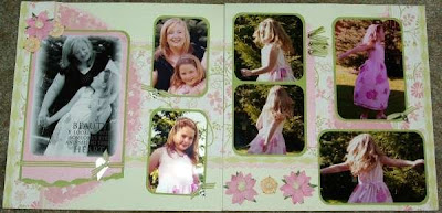
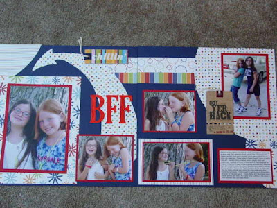
In this layout, that a friend of mine scrapped for me, she did a wonderful job conveying a girlie, soft, Mom & Daughter theme with the papers and embellishments she chose. She showcases these pictures of my daughter and I beautifully!


2. Choose a Focal Picture:

If you are scrapping with a grouping of pictures, choose one from the grouping to be your focal picture. It might be what you consider your favorite out of the bunch. Or it may be the picture that best conveys the mood or theme of the photos. When designing your layout, treat your focal picture special, do something to make it stand out. You can double mat the photo, crop other photos smaller, or accent in a creative way.

In this layout I emphesized the focal picture by adding an arrow:

3. Use Color and Pattern to Emphesis Your Theme:

Now that you’ve identified your Theme or Mood and have your focal picture, select colors that will compliment the focal picture, and colors and/or patterns that will help to convey your theme.

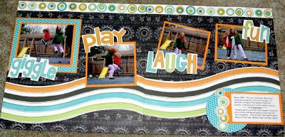
In this layout with pictures of my kids on the trampoline, I wanted to convey the theme of fun and motion. I used playful and bright colors and added fun wavey paper to give the feeling of motion.


4. Use Repetition to Convey Theme and Enhance Photos:

Select elements to add to your page that repeat the theme. Elements can be stickers, pre-made embellishments, shapes, or even colors & patterns.


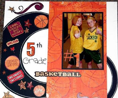
In this layout, I used girls basketball accents to enhance my theme:


5. Flow & Balance:

Flow: Design your layout to make it easy for the eye to follow through the design. Our eye is used to traveling from left to right, so an easy way to layout a page is to start with your focal picture and add other photos or accents going to the right.

Balance: When designing a double page layout, try to be careful to not overload one side of the layout making it appear heavier than the other. Remember larger accents have more weight, and smaller accents appear lighter. You can balance a large photo with maybe two or three corresponding smaller photos. You also want to balance your colors. Your design will be more appealing if you use color choices on both sides of the layout. So if you add a splash of yellow to the left side, balance it out with a splash of orange on the right.

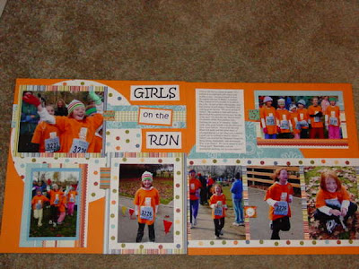
When you view this layout, your eye easily follows from left right by starting with the focal picture and placing the photos on the right in a linear pattern. I added balance to the layout by using the same papers on both sides of the layout. I also balanced the weight of three pictures on the left side, and four pictures on the right by adding the circle behind the focal picture to make it stand out more and give it more "weight".
Now remember everything I shared with you here are guidelines. Do they need to be applied on every layout you scrap? - NO! But if you think about, and follow some of these guidelines, it might help get your creative juices flowing, and you might find that you like the end result of your layouts more.

What about you? Can anyone share any layout or ideas they have either applying the design prinicples above? Or do you have a design principle that you use that you find makes your scrapping better. Send us an e-mail at info@iceescape.net, or post a comment on the blog. Who knows, I may have a surprise for some lucky person who shares.


Wednesday, July 2, 2008

Lesson Learned!

Wow! The summer is just wizzing by! Don't worry the ICE team hasn't melted in the summer heat! We took a small break and spent some time focusing on our families, but are now back into full swing! We are excited to get the ball rolling on next years big ICE Escape weekend and will be announcing details soon!
I have had a chance to get a bit of scrapping done the past couple of weeks, I didn't know how much I have missed playing with scissors and paper!

I thought this would be a fun LO to share. Most of us with wee ones spend quite a bit of time at the park throught the summer trying to keep the kids entertaned and keep our own sanity! Also along with summer is spending time with family & friends. As scrappers there is usally a camera or two always in the mist to capture great shots so they can grace our pages in our albums.

On this outing to the park with my sisters kids I thought it would be fun to get a shot off all the kids on the slide. How cute right? WRONG! We sent the oldest down first, then the younger ones, but the slide was too steep and everyone was getting squished. By the time we got to the 6th kid, they were screaming and crying. But hey it made for a pretty funny picture and LO!

I hope everyone has a wonderful 4th of July!!

***Heather***